3D class
Monday, December 7, 2015
Project 3 Write up
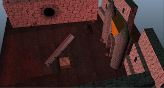
This
castle is a rock quarry set in a volcanic wasteland. Its set in a volcanic
wasteland because volcanoes are ground zero for finding all kinds of interesting
rocks and sediments; also, volcanoes shoot out lava that cools and becomes
rock. If I were to make up a story for this castle it would be that it is part
of a country whose main goal is gaining knowledge. This location happens to be
important to finding out what goes on
inside the Earth and scientists of the country want to know that.
Wednesday, November 18, 2015
Project 3 Source Images
I ended up pulling all my images strait from google images. They are all just pictures of random castles and mines save for the first one which is a concept art from the game Dragon Age Inquisition.
Monday, November 9, 2015
Project 1 (Blockville)
This is my one and only reference image.
Screen cap 1 of 3
2 of 3
and 3 of 3
Reflective Essay:
Unfortunately, I had already finished my Blockville before I learned that we needed 3 reference images. My hope was that the feeling of scale would come across when you saw the big buildings in comparison the the small building attachments (the water towers and smoke stacks).
This is where I learned how important repetition is in Maya. I had 2 or 3 tall buildings finished when I was shown that copping the same building 17 times and changing it a little each time pretty much finished the project.
Project 2 (interior)
Here we have my final product,
my product without lighting,
and the project with just modeling.
Reflective Essay:
I started out wanting to have a sort of fantasy setting, archways and ruins and what-not. I decided that I preferred to make a more modern scene. I left the archways and wanted to focus mainly on foreground, middle ground, and background. My foreground is the TV, couch, and table. The middle ground consists of the stone wall and the counter, and the background is a bunch of boxes.
I wasn't trying to invoke any emotions from people who would see this. Card board boxes, simple brown colors, this was simply and exercise in trying to learn things about 3D design.
There are many things I would like to improve in this project, mostly the textures. It is easiest to see with the couch; I have not quite figured out how to do UV mapping. It was the shamfered verts that messed me up. The UVs were twisted and tangled and I couldn't figure out how to smooth them out.
I also was having trouble with the lighting, mainly because the lights in Maya are no at all like lights in real life. It turned out to be quite difficult to get the lighting effects that I wanted but over all I think it turned out ok.
Reference Images:
Subscribe to:
Comments (Atom)


